Graphic Design Trends for Long Form Content
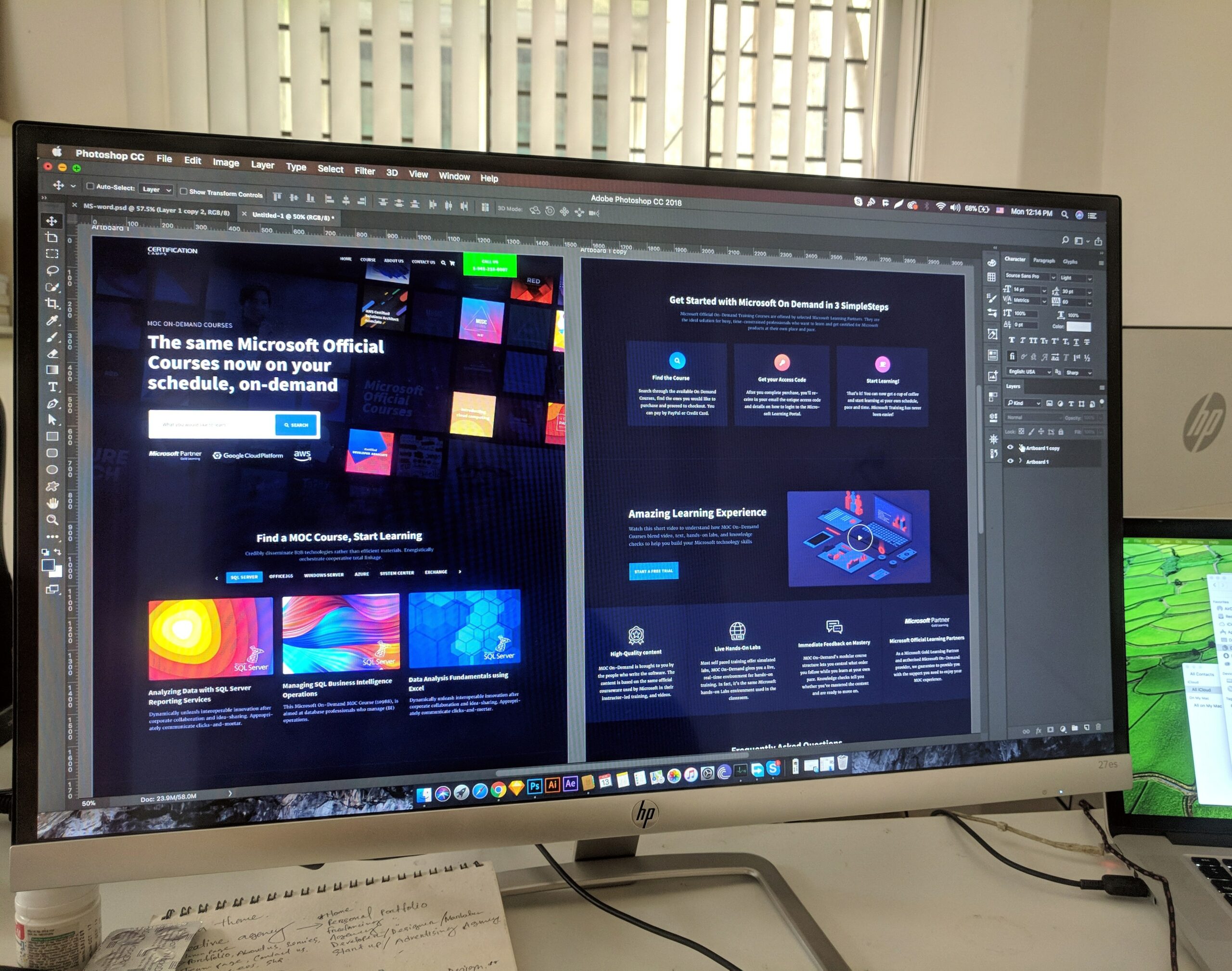
SEO loves long form content, and, so do readers. But, there’s more to a successful long form piece than 2,000 words, and that’s where good design comes in. In 2020, good design isn’t just desirable; it’s expected. But, how do you elevate your long form online output with good design? What are the leading creators of long form doing from a design perspective to elevate their content?
Right now, what are the most successful graphic design trends for long form content?
First, consider responsive design
Generally speaking, the best long form content we’re seeing online is presented as RWD—responsive web design—which is an approach that makes web pages render well on a variety of devices and screen sizes. The fluid grid used by RWD dictates that page element sizing be in relative units, like percentages, instead of absolute units like pixels or points. In other words, your layout will be dynamic, shifting slightly depending on the device it’s being viewed on. The benefit is that your content will always be presented successfully and completely.
In 2020, good design isn’t just desirable; it’s expected, not just for customer experience, but for SEO as well.Unlike when working with a printed page, you’re designing a composition that will not be fixed. For control freaks like me, this is a tricky pill to swallow, but, it’s a necessary one to work within the dynamic realm. A good rule of thumb is that it’s more important to get the fundamentals right, as the details will often shift. Page hierarchy will hold, but there may be a change in the relational positioning of items as the reader scrolls through your content.
Full-screen photography
Photography is a hugely important to long form content; having at least one image in your post generates 94 percent(!) more views, according to Skyward Research, and good photography can only increase that figure. Skip the cheap stock photography for your long form content if you can.
And, also unlike with the printed page, you have the real estate—at least vertically—to go big with your images. Consider the composition of images and overlay copy when and where it makes sense. Take advantage of the space.
Thoughtful typography for headlines and serif fonts for body copy
Think about the opening spread of a well-executed editorial feature in a magazine. How do the typefaces chosen support the narrative? Consider the integration of the headline and the image, and remember that you can enhance it further with animation or interactivity.
Just as serif fonts lend themselves to body copy in printed books, long format pieces often benefit from the inherent readability of serifed type as well, with serifs serving as virtual horizontal rules to guide the eye.
Pull quotes that add visual interest and contextual emphasis
Pull quotes help to break up the monotony of what’s effectively a very tall page, and, allow for different levels of reading. A compelling pull quote can entice the casual reader into consuming the full content of a piece, or, can emphasize a key theme. They’re an easy addition and well worth considering.
Impactful infographics and interactive maps
Why have a static infographic when you can make it more powerful through simple animation? And think about how much more impactful a long format travel piece would be with a running map, advancing along as you progress in kind through the narrative? Within the map could be links for further information on specific towns or attractions, for example.
While covering COVID-19, news outlets like The New York Times and The Washington Post have visually illustrated the spread of the disease across the American states and countries of the world in a way that would not have been nearly as successfully conveyed by a fixed page.
Videos with a message and animation with a purpose
Content is nothing if it’s not compelling. If you are going to include videos or animation, make it worth your viewers’ time; perhaps an interview, a reference point, or a deeper dive. Oh, and don’t auto-start your videos, at least not with sound; there’s no quicker way to disengage your viewer.
Ultimately, with long form content, the design goal is to create an immersive editorial experience. It should support the story being told, fully engage the reader, and maximize the viewing time.
Reach Out
Be Social
Content Marketing
Next In AI
Use AI to Inspire Your Writing: 7 Tips to Spark Creativity
Explore 7 tips to fuel your writing with AI, from sparking creativity to enhancing your style with Eve Connell's expert...

