Typeface/Font* Selection: A Practical Guide

We could also call this post, “how to avoid being spoofed on Saturday Night Live.”
As evidenced by a recent SNL sketch which lampoons the font chosen for the movie Avatar, proper typeface selection—awareness of which was once generally considered limited to graphic designers like myself—has entered into the mainstream consciousness. That’s a good thing, and long overdue. However, that newfound attention also makes it more important than ever to make the right choices when it comes to choosing fonts.
We’ve all seen it. Odd, inappropriate or just downright puzzling font choices in the business world and beyond. For example, serious professional correspondence set in Comic Sans. A lighthearted advertising message made seemingly angry through the use of a font like Impact. Or, a feature film title set in what appears to be nothing more than a lazily chosen Microsoft system font, like Papyrus. Type can be powerful, evoking emotion and possessing the ability to enhance (or detract from) your message. And, while we might not know what the designers behind Avatar’s curious choice were thinking, many of the poor font choices we encounter day to day can be chalked up to how the average computer user now has almost endless font choice at their disposal but little actual typographical knowledge with which to guide them.
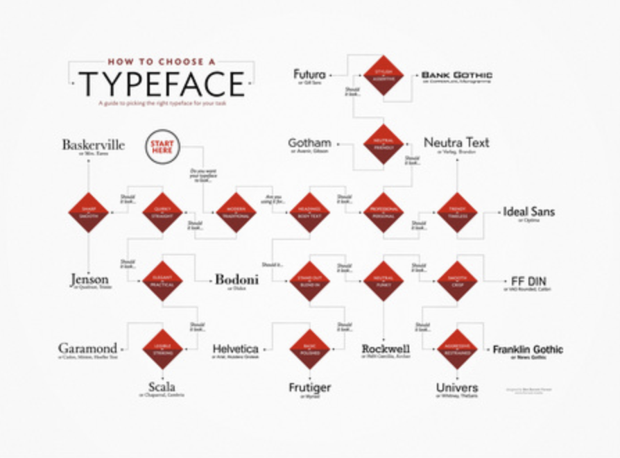
Volumes have been written about proper type selection. There are historical, cultural and practical aspects as well as many subjective considerations. It’s impossible, of course, to summarize it all in one brief blog post. There are, however, a few very basic considerations to keep in mind the next time you’re choosing typefaces for a project. Stick to the following and I will personally guarantee that you’ll avoid the shame and embarrassment that comes with being the subject of a Saturday Night Live sketch.
Suitability and context
When choosing a typeface for your project, carefully consider your audience and your message. Typefaces are atmospheric. Does your chosen typeface fit the mood of your message? Does it whisper? Does it scream? Does it repulse or engage? Is it derivative? Are there any negative associations with the typeface? Should it be bold? Would a serif or sans-serif font be better suited for your application?
Serif vs sans-serif—what’s the difference?
While there are numerous styles of type, the two most common variations are serif and sans-serif.
Serif typefaces, named for the serifs or small notches or lines at the letter’s corners, are often your best bet for body copy, particularly in printed materials. Many people find serif fonts easier to read, particularly for long passages, since the serifs can serve as virtual horizontal rules to guide your eye. Serif typefaces—like Courier and Times New Roman—tend to be considered more traditional, too; they’re what you’ll find most books set in and are what most word processing apps will default to.
Sans-serif typefaces, which lack the small flourishes described above, are often the right choice for headlines and shorter blocks of copy. Sans-serif typefaces, like Helvetica and Arial, are generally considered to be more modern, as well. Often sans-serif typefaces work better on-screen, too, as their relative simplicity allows for easier scaling and rendering.
Handwritten and script-style typefaces
You’ll also often encounter handwritten and script-style fonts, too, but, they aren’t really meant for the workplace. But, if they are utilized, they should never, ever, be set in all caps. There are few more egregious offenses that can be committed with type than a script font set in all caps.
General legibility
Are you using different type sizes and weights to express the hierarchy of information in your project? For body copy, 10 to 12-point type is generally a safe bet. Headlines can be made much larger, of course, but they should be sized in a way that they complement what they are introducing. Are you are using multiple typefaces within a project, and, if you are, do they harmonize with each other? Are you contrasting a serif type face with a sans-serif one? If not, are the two fonts distinct enough to each hold their own?
Why it matters
Ultimately, choosing the right typeface means that you are communicating in the most effective possible way. The right typeface can be as important to your message as the actual written content. And even the most rudimentary consideration of type choice will keep you one step ahead of your competition. And one step ahead of the producers of Avatar.
*Incidentally, while I use the terms typeface and font interchangeably here, technically, a typeface is a family of related fonts. A font is simply one particular variation or weight of a letterform within that type family.
Reach Out
Be Social
Content Marketing
Next In AI
Use AI to Inspire Your Writing: 7 Tips to Spark Creativity
Explore 7 tips to fuel your writing with AI, from sparking creativity to enhancing your style with Eve Connell's expert...


